ފަންވަތް:Multiple image
This template creates a box containing between two and ten images, arranged either vertically or horizontally and with captions for the entire box or per image.
With the appropriate choice of parameters, the template can automatically resize images to a given total width with each image having the same height.
Be aware that this template does not respect users' default image size preferences. (Wikipedia:Image use policy states: ފަންވަތް:Tq states that a fixed width in pixels may only be specified, ފަންވަތް:Tq)[lower-alpha 1]
If image size parameters are omitted, this template sets all images at 200px wide, regardless of whether the reader has set a preference for some other default image width. This causes multiple images to look out of scale to the other images in an article.
Syntax and parameters
[އުނިއިތުރު ގެންނަވާ]Provide height[n] and total_width parameters to obtain automatic resizing. Note the different meanings of the width[n] parameters with vs. without automatic resizing. Please also note the option to set a total_width parameter at the beginning of the multiple image template.
- Automatic resizing of all images to the same height and to a given total width
{{Multiple image|total_width = 600
<!-- Layout parameters -->
| align             = <!-- right (default), left, center, none -->
| direction         = <!-- horizontal (default), vertical -->
| background color  = <!-- box background as a 'hex triplet' web color prefixed by # e.g. #33CC00 -->
| width             = <!-- displayed width of each image in pixels (an integer, omit "px" suffix); overrides "width[n]"s below -->
| caption_align     = <!-- left (default), center, right -->
| image_style       = <!-- border:1; (default) -->
| image_gap         = <!-- 5 (default)-->

<!-- Header -->
| header_background = <!-- header background as a 'hex triplet' web color prefixed by # e.g. #33CC00 -->
| header_align      = <!-- center (default), left, right -->
| header            = <!-- header text -->

<!--image 1-->
| image1            = <!-- filename only, i.e. without "File:" or "Image:" prefix -->
| width1            = <!-- displayed width of image; overridden by "width" above -->
| alt1              =
| link1             =
| thumbtime1        =
| caption1          =
<!--image 2-->
| image2            = <!-- filename only, i.e. without "File:" or "Image:" prefix -->
| width2            = <!-- displayed width of image; overridden by "width" above -->
| alt2              =
| link2             =
| thumbtime2        =
| caption2          =
<!-- and so on -->

<!-- Footer -->
| footer_background = <!-- footer background as a 'hex triplet' web color prefixed by # e.g. #33CC00 -->
| footer_align      = <!-- left (default), center, right -->
| footer            = <!-- footer text -->
}}
- No automatic resizing of all images to the same height
{{multiple image
<!-- Layout parameters -->
 | align             = <!-- right (default), left, center, none -->
 | direction         = <!-- horizontal (default), vertical -->
 | background color  = <!-- box background -->
 | total_width       = <!-- total width of all the displayed images in pixels (an integer, omit "px" suffix) -->
 | caption_align     = <!-- left (default), center, right -->

<!-- Header -->
 | header_background =
 | header_align      = <!-- center (default), left, right -->
 | header            =

<!--image 1-->
 | image1            = <!-- filename only, i.e. without "File:" or "Image:" prefix -->
 | alt1              =
 | link1             =
 | thumbtime1        =
 | caption1          =
<!--image 2-->
 | image2            = <!-- filename only, i.e. without "File:" or "Image:" prefix -->
 | alt2              =
 | link2             =
 | thumbtime2        =
 | caption2          =
<!-- and so on -->

<!-- Footer -->
 | footer_background =
 | footer_align      = <!-- left (default), center, right -->
 | footer            =
}}
| Parameter | Description |
|---|---|
| align | right (default), left, center |
| direction | horizontal (default), vertical |
| background color | To set the background color of the box in which the images appear. |
| header_background | |
| header_align | center (default), left, right |
| header | |
| width | Use to set the same width for each image (i.e. overrides any ފަންވަތް:Mono below). Do not include if different image widths intended, including if images are to be resized to a fixed total width. |
| total_width | Use to scale the images to the same height and this total width. Do not use both ފަންވަތް:Mono and ފަންވަތް:Mono. |
| image[n] | (where [n] = 1 to 10) Filename of [n]th image. |
| width[n] | (as above) Two meanings: (1) The width (in pixels, integer, omit "px") of [n]th image. Overridden by ފަންވަތް:Mono (if set). (2) The full width of the original [n]th image if ފަންވަތް:Mono is given in order to resize all images to the same height and a given total width. |
| height[n] | (as above) The full height of the original [n]th image if ފަންވަތް:Mono is given in order to resize all images to the same height and a given total width. Ignored otherwise. |
| alt[n] | (as above) Alt description for [n]th image. |
| link[n] | (as above) The page linked to the [n]th image (i.e. the page that is loaded when the image is clicked).
|
| thumbtime[n] | (as above) When using video files, sets the time within the video that is used for the initial display. This is either a number of seconds or hours:minutes:seconds; see commons:Commons:Video#Setting a video thumbnail image. |
| caption[n] | (as above) Caption for the [n]th image. |
| caption_align | left (default), center, right |
| footer_background | |
| footer_align | left (default), center, right |
| footer | Caption that spans the entire box, as opposed to individual images. Avoid "left" and "right" if possible, since mobile devices may display the images vertically. |
Examples
[އުނިއިތުރު ގެންނަވާ]{{multiple image
| width = 60
| image1 = Yellow card.svg
| alt1 = Yellow cartouche
| image2 = Red card.svg
| alt2 = Red cartouche
| footer = Players are cautioned with a yellow card and sent off with a red card.
}}
{{multiple image
 | align = left
 | direction = vertical
 | width = 200
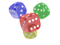
 | header = [[Portable Network Graphics|PNG]] transparency demonstration
 | image1 = PNG transparency demonstration 1.png
 | alt1 = Colored dice with white background
 | caption1 = A PNG image with an 8-bit transparency layer...
 | image2 = PNG transparency demonstration 2.png
 | alt2 = Colored dice with checkered background
 | caption2 = ...here overlaying a checkered background.
}}
{{multiple image
 | width = 60
 | image1=Ribbon numeral 2.png | alt1=2
 | image2=Ribbon numeral 3.png | alt2=3
 | image3=Ribbon numeral 4.png | alt3=4
 | footer = When a user has many of one type of [[WP:BARN|barnstar]], they can represent them with [[WP:RIBBON|ribbons]] and these numerals to indicate the count.
}}
With background color
[އުނިއިތުރު ގެންނަވާ]{{multiple image
| background color = #BBDD99
| width = 160
| image1 = Adoxa_moschatellina_210406.jpg
| alt1 = Green herb with a few tiny yellow-white flowers
| image2 = Adoxa_moschatellina_210406a.jpg
| alt2 = Three small white and yellow flowers before green-leaf background
| image3 = adoxa_moschatellina_blatt.jpeg
| alt3 = Leaves of a plant, in groups of three each with three lobes
| footer_background = #33CC00
| footer_align = center
| footer = ''[[Adoxa]]'' (''Adoxa moschatellina'')
}}
If the images have a clear background, this will by default be changed to white. To make the background color of the images match, set them with image_style=background-color. You might want to also remove the border.
{{multiple image
| align = center
| width = 64
| background color = black
| image_style=background-color:black; border:none;
| image1 = Aries symbol (planetary color).svg|link1=Aries (astrology)
| image2 = Taurus symbol (planetary color).svg|link2=Taurus (astrology)
| image3 = Gemini symbol (planetary color).svg|link3=Gemini (astrology)
| image4 = Leo symbol (planetary color).svg|link4=Leo (astrology)
}}
With links (link[n])
[އުނިއިތުރު ގެންނަވާ]{{multiple image
| align = left
| image1 = Frecklesmule.jpg
| width1 = 143
| alt1 = A mule
| link1 = Mule
| caption1 = A mule<br />(骡子 ''luózi'')
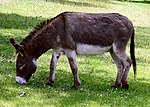
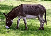
| image2 = Donkey 1 arp 750px.jpg
| width2 = 150
| alt2 = A donkey
| link2 =
| caption2 = A donkey<br />(驴子 ''lǘzi'')
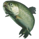
| image3 = Rainbow_trout.png
| width3 = 91
| alt3 = A trout
| caption3 = A fish<br />({{lang|zh|2=鱼}} ''yú'')
| footer = The image of the mule links to [[Mule]]; the image of the donkey does not link anywhere; the image of the trout links to a [[Image description page|standard image description page]].
}}
Using direction
[އުނިއިތުރު ގެންނަވާ]By default, the images the template presents are displayed horizontally, as a row (see left; equivalent to setting ފަންވަތް:Mono). To display them vertically, i.e. as a column, set ފަންވަތް:Mono (see right).
On mobile devices some images may always be displayed vertically if the total width is larger than around 320.
To match image heights
[އުނިއިތުރު ގެންނަވާ]- Decide on a total width for all the images, say 320px
- Set the total width using
|total_width=
{{multiple image
 | align = right
 | total_width = 320

 | image1 = Donkey 1 arp 750px.jpg
 | alt1 = A donkey
 | caption1 = Rectangular image of a donkey, originally 536 pixels high.

 | image2 = Rainbow_trout.png
 | alt2 = A trout
 | caption2 = Square image of a trout, originally 300 pixels high.

 | footer = Both images have been rendered with the same height, and a total width of 320px
}}
Using the width[n]= and height[n]= parameters.
width2 x height2 = 900 x 900.width3 x height3 = 100 x 200.width4 x height4 = 200 x 100.{{multiple image
| align = right
| total_width = 480
| image1 = Rainbow_trout.png
| caption1 = Square image of a trout, originally 300 x 300 pixels.
| image2 = Rainbow_trout.png
| width2 = 900
| height2 = 900
| caption2 = <code>width2</code> x <code>height2</code> = 900 x 900.
| image3 = Rainbow_trout.png
| width3 = 100
| height3 = 200
| caption3 = <code>width3</code> x <code>height3</code> = 100 x 200.
| image4 = Rainbow_trout.png
| width4 = 200
| height4 = 100
| caption4 = <code>width4</code> x <code>height4</code> = 200 x 100.
| footer = All images have been rendered with the same height except for image3, which is 100/200 = 1/2 the height of the other images. Image4 is 200/100 = 2 times the height of image1, so only its top half is visible. Total width set to 480px.
}}
The aspect ratio of each image is automatically retrieved from the File metadata. You can override the native width and height values by
- Examining the individual image pages to obtain the full resolution. For example:
- File:Donkey 1 arp 750px.jpg shows "Donkey_1_arp_750px.jpg (750 × 536 pixels, file size: 125 KB, MIME type: image/jpeg)"
- File:Rainbow trout.png shows "Rainbow_trout.png (300 × 300 pixels, file size: 158 KB, MIME type: image/png)"
- Specify the full width and height for each image, of the form:
|width1=|height1=|width2=|height2=
Multiple rows
[އުނިއިތުރު ގެންނަވާ]To create an array of images, with multiple rows, use |perrow=. The value passed to |perrow= may be a single number, or a list of numbers delimited by /. This feature may also be combined with |total_width= for multiple rows of images with the same total width.
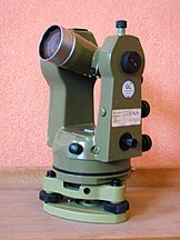
{{multiple image|perrow = 2|total_width=300
| image1 = Kern_Theodolit_DKM2-A.jpg
| image2 = Total-Robotic-Station.jpg
| image3 = DumpyLevel.jpg
| image4 = GPS_Survey_Equipment_at_Weir_Dyke_Bridge_-_geograph.org.uk_-_336908.jpg
| footer = Surveying Equipment. Clockwise from upper left: Optical Theodolite, Robotic total station, [[Real-time kinematic|RTK]] GPS Base station, Optical level.
}}
Removing the image border
[އުނިއިތުރު ގެންނަވާ]The border around the images can be removed using |image_style=border:none.
{{multiple image
 | align = right
 | total_width = 320
 | image_style = border:none;

 | image1 = Donkey 1 arp 750px.jpg
 | alt1 = A donkey
 | caption1 = Image of a donkey

 | image2 = Rainbow_trout.png
 | alt2 = A trout
 | caption2 = Image of a trout
}}
Increasing the gap between images
[އުނިއިތުރު ގެންނަވާ]The gap between the images can be increased using |image_gap=N, where N is the number of pixels (must be non-negative).
{{multiple image
 | align = right
 | total_width = 320
 | image_gap = 20

 | image1 = Donkey 1 arp 750px.jpg
 | alt1 = A donkey
 | caption1 = Image of a donkey

 | image2 = Rainbow_trout.png
 | alt2 = A trout
 | caption2 = Image of a trout
}}
Directly invoking module
[އުނިއިތުރު ގެންނަވާ]On large pages, multiple uses of this template can contribute to the page exceeding the maximum post-expand include size limit. To reduce the include size, Module:Multiple image can be invoked directly as follows (note the extra "|" character after the module name):
{{#invoke:multiple image|
 | width = 60
 | image1 = OOjs UI icon wikiTemplate.svg
 | image2 = Cib-lua (CoreUI Icons v1.0.0).svg
}}
TemplateData
[އުނިއިތުރު ގެންނަވާ]Multiple image
This template creates a box with two to ten images arranged vertically or horizontally with captions for the entire box and each image.
| Parameter | Description | Type | Status | |
|---|---|---|---|---|
| Alignment | align | Sets text-wrapping around image box, where "none" places the box on the left edge with no text-wrapping, "center" places the box at center with no text-wrapping and "left" and "right" refer to position of box on screen with text-wrapping.
| String | optional |
| Direction | direction | Direction in which to tile the images.
| String | suggested |
| Frame width | total_width | Use to scale the images to the same height and this total width. Do not use both total_width and width. Integer width in pixels; no "px" suffix
| Number | suggested |
| Row layout | perrow | Create an array of images, with multiple rows. The value passed to may be a single number or a list of numbers with each row delimited by /. Can be combined with total_width for automatic sizing of images.
| String | optional |
| Image width | width | Width overrides Width 1, Width 2, Width 3, etc. If you want the images to be different sizes, do not provide the width parameter. Integer width in pixels; no "px" suffix
| Number | optional |
| Background color | background color | Defines the background color between the border of the box and the images. Changing the background can be bad for accessibility, avoid when possible.
| String | optional |
| Caption alignment | caption_align | no description
| String | optional |
| Image 1 | image1 | Image 1 is name of first image. Similarly for Image 2, etc. File name only; no "File:" or "Image:" prefix.
| File | required |
| Width 1 | width1 | Width 1 is width of first image. Similarly for Width 2, etc. | Number | optional |
| Alt text 1 | alt1 | The [[alt text]] of first image (see [[WP:ALT]]). Similarly for Alt text 2, etc. | Line | suggested |
| Caption 1 | caption1 | Caption 1 is caption of first image. Similarly for Caption 2, etc. | Content | suggested |
| Link 1 | link1 | Where the first page links to. Similarly for Link 2, etc. If not specified, image links to the image description page as usual. If specified to the empty value, the image does not link anywhere; this should be used for purely decorative images as per [[WP:ALT]]. Important: If the image is under a free license like the GFDL or a CC license, you must not use this parameter as the terms of those licenses require the license, or a link to it, to be reproduced with the image. The image must, therefore, link to its image page. Public domain and (theoretically) non-free use images are not subject to this restriction. | Page name | optional |
| Thumbtime 1 | thumbtime1 | If image1 is an Ogg Theora file, sets the time within the video that is used for the initial display. Either a number of seconds or hours:minutes:seconds. Similarly for Thumb time 2, etc. | String | optional |
| Image 2 | image2 | no description
| File | suggested |
| Width 2 | width2 | no description | Number | optional |
| Alt text 2 | alt2 | no description | Line | suggested |
| Caption 2 | caption2 | no description | Content | suggested |
| Link 2 | link2 | no description | Page name | optional |
| Thumbtime 2 | thumbtime2 | no description | String | optional |
| Image 3 | image3 | no description
| File | optional |
| Width 3 | width3 | no description | Number | optional |
| Alt text 3 | alt3 | no description | Line | optional |
| Caption 3 | caption3 | no description | Content | optional |
| Link 3 | link3 | no description | Page name | optional |
| Thumbtime 3 | thumbtime3 | no description | String | optional |
| Image 4 | image4 | no description
| File | optional |
| Width 4 | width4 | no description | Number | optional |
| Alt text 4 | alt4 | no description | Line | optional |
| Caption 4 | caption4 | no description | Content | optional |
| Link 4 | link4 | no description | Page name | optional |
| Thumbtime 4 | thumbtime4 | no description | String | optional |
| Image 5 | image5 | no description
| File | optional |
| Width 5 | width5 | no description | Number | optional |
| Alt text 5 | alt5 | no description | Line | optional |
| Caption 5 | caption5 | no description | Content | optional |
| Link 5 | link5 | no description | Page name | optional |
| Thumbtime 5 | thumbtime5 | no description | String | optional |
| Image 6 | image6 | no description
| File | optional |
| Width 6 | width6 | no description | Number | optional |
| Alt text 6 | alt6 | no description | Line | optional |
| Caption 6 | caption6 | no description | Content | optional |
| Link 6 | link6 | no description | Page name | optional |
| Thumbtime 6 | thumbtime6 | no description | String | optional |
| Image 7 | image7 | no description
| File | optional |
| Width 7 | width7 | no description | Number | optional |
| Alt text 7 | alt7 | no description | Line | optional |
| Caption 7 | caption7 | no description | Content | optional |
| Link 7 | link7 | no description | Page name | optional |
| Thumbtime 7 | thumbtime7 | no description | String | optional |
| Image 8 | image8 | no description
| File | optional |
| Width 8 | width8 | no description | Number | optional |
| Alt text 8 | alt8 | no description | Line | optional |
| Caption 8 | caption8 | no description | Content | optional |
| Link 8 | link8 | no description | Page name | optional |
| Thumbtime 8 | thumbtime8 | no description | String | optional |
| Image 9 | image9 | no description
| File | optional |
| Width 9 | width9 | no description | Number | optional |
| Alt text 9 | alt9 | no description | Line | optional |
| Caption 9 | caption9 | no description | Content | optional |
| Link 9 | link9 | no description | Page name | optional |
| Thumbtime 9 | thumbtime9 | no description | String | optional |
| Image 10 | image10 | no description
| File | optional |
| Width 10 | width10 | no description | Number | optional |
| Alt text 10 | alt10 | no description | Line | optional |
| Caption 10 | caption10 | no description | Content | optional |
| Link 10 | link10 | no description | Page name | optional |
| Thumbtime 10 | thumbtime10 | no description | String | optional |
| Image gap | image_gap | Override the distance between adjacent images. Integer width in pixels; no "px" suffix
| Number | optional |
| Image style | image_style | Override the default styling of the image frame. | String | optional |
| Header | header | A header text to place above the entire frame. | Content | optional |
| Header background | header_background | Defines the background color of the header field. Changing the background can be bad for accessibility, avoid when possible
| String | optional |
| Header alignment | header_align | no description
| String | optional |
| Footer | footer | Caption that spans the entire box, as opposed to individual images. Avoid "left" and "right" if possible, since mobile devices may display the images vertically. | Content | optional |
| Footer background | footer_background | Defines the background color of the footer field. Changing the background can be bad for accessibility, avoid when possible
| String | optional |
| Footer alignment | footer_align | no description
| String | optional |
| Show or hide border | border | Use value "infobox" to hide the border when using the template within an infobox.
| Unknown | optional |
Tracking categories
[އުނިއިތުރު ގެންނަވާ]- Category:Pages using multiple image with auto scaled images (5)
- Category:Pages using multiple image with manual scaled images (2)
Notes
[އުނިއިތުރު ގެންނަވާ]See also
[އުނިއިތުރު ގެންނަވާ]{{Gallery}}
{{Image array}}
{{Image frame}}
{{Photomontage}}
{{Stack}}
| The above documentation is transcluded from ފަންވަތް:Multiple image/doc. (edit | history) Editors can experiment in this template's sandbox (create | mirror) and testcases (create) pages. Please add categories to the /doc subpage. Subpages of this template. |
Cite error: <ref> tags exist for a group named "lower-alpha", but no corresponding <references group="lower-alpha"/> tag was found
- Pages using multiple image with auto scaled images
- Pages using multiple image with manual scaled images
- TemplateData documentation
- Graphics templates
- Image formatting and function templates
- Templates that add a tracking category
- Pages with reference errors
- Pages with reference errors that trigger visual diffs


